First of all, I don’t know that Google is really trying to pull one over on its users. This could just be the work of some clueless PR guy.
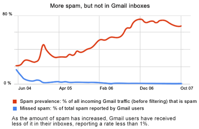
On the Official Google Blog today, Brad Taylor, a “Spam Czar” at Google, talked about how Gmail filters more spam now than ever. He links to a Spam explained page at Gmail, and includes the graph shown there. As you can see, the graph has two lines on it. The top, orange, ascending line represents the growing amount of spam in circulation. The bottom, blue, descending line represents the declining amount of spam in Gmail users’ inboxes. The caption reinforces this perception, saying, “As the amount of spam has increased, Gmail users have received less of it in their inboxes, reporting a rate less than 1%.”
The thing is, if you look closely, you’ll see that this is not what the numbers say!

So then, “a rate of less than 1%,” eh? That means that less than 1% of the email users get in their inboxes is spam, right? And spam represents 70% of the email Gmail gets, which is the orange line. So Gmail filters out the other 69% automatically, right? Wrong!
Because if you look carefully at the legend of the blue line, it does not tell you anything about how much spam Gmail users get. The orange line does tell you how much spam Gmail gets, but the blue line should be “percent of total email in inboxes that is spam.” But that’s not what they show you. Rather, they subtly shift the terms of the measurement without drawing your attention to it. They subtly shift from “percent of total email” to “percent of total spam” that gets to email inboxes.
Here’s the real problem: Google claims they’ve made great strides in filtering out spam, and I’m sure they have. In general, spam filtering has improved everywhere, in that never-ending battle between spammers and the rest of us. But here’s the thing, the way Google has defined the graph, even if Gmail users are getting more spam now than ever, the blue line could still trend downward. Because the blue line represents how much spam Gmail filters out, not how much spam is in user’s inboxes.
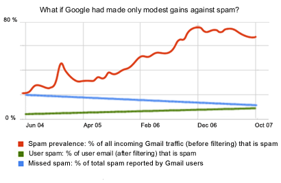
Look at it this way, let’s say Google had done absolutely nothing. Let’s say Gmail were to filter out the same proportion of spam today as it did 3 years ago. Over those years, the amount of spam has increased by over 3 times, as you can see from the orange line. Therefore, if Gmail’s spam filtering were only as good as it was 3 years ago, users would be getting over 3 times as much spam in their inboxes, compared to the legitimate email they get. But what would the blue line look like? Would it have grown over 3 times, representing the increased amount of spam being delivered to users? No! It would be completely flat, representing the fact that Google has not lost any ground to the spammers. But that would not be the perception that most Gmail users would have.
 Now let’s say Google had made only modest gains against the spammers. While overall spam has increased by over 3 times (the orange line), let’s suppose that spam in Gmail inboxes has increased by only doubling. That means Gmail users would be seeing twice as much spam today than they did 3 years ago. That’s the green line in the mocked-up chart. But what would the blue line look like? Yes, that’s right. The blue line would be descending, showing less spam, even though users would be getting more spam today than ever.
Given the choice between the blue and green lines, which one would you choose to put on your marketing materials?
The bottom line (no pun intended) is that Google has chosen the blue line to make themselves look better than they actually are. They put it on the same graph with the orange line, which correctly shows more spam in circulation than ever. But instead of choosing the green-line measurement from the mocked-up graph, the one that accurately represents how much less spam Gmail users get today, Google chose a subtly different measurement that makes themselves look deceptively better than they really are.
And here’s the thing: Google doesn’t have to do that. And neither do you.
It’s said that marketers and salesmen are liars. They have no scruples, and they’ll sell you snake oil if it means another dollar in their pockets. But I say, it’s only stupid marketers and salesmen who do that. If you have something that’s valuable (like Google does in Gmail) you don’t need to distort your statistics and over-hype it, because what you have is what your customer wants. But if you do choose to distort your statistics and to over-hype it, you’ll make yourself seem like a snake-oil salesman. Because only snake-oil salesmen need to lie to make their offering seem valuable.
-TimK

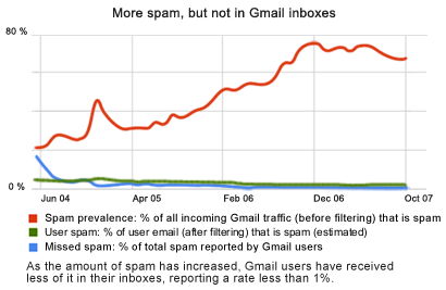
P.S. (Added the evening of October 30 at about midnight.) Here’s another mocked-up graph, this time showing the green line as it would appear, at least as best I can make out, or something like that. It’s just an estimate, because I don’t actually have the numbers that Google used to construct the original graph. But I can get a good idea, based on the orange and the blue lines.
To reiterate: Google does a great job with spam, as can be seen by the fact that the spam in Gmail users’ inboxes has decreased, despite the fact that Gmail has been deluged with spam (as have we all).
I have to keep reiterating that, because this graph unfortunately speaks for itself, and I feel like I need to point out what a great job Google has been doing. Which of the two do you think makes Google look better? The blue line or the green line? And once you know that Google included in its marketing materials the blue line–regardless of how much more useful a measurement it is–but that the green line shows this information using the same scale as the orange line… You can see why I need to keep reiterating that Google has been doing a great job and still does a great job.
I guess I’m saying, be careful what you’re communicating to your users, especially if you’re an engineer. Consider that the green line tells the same story as the blue line, just in a different way. The title of the graph is the same: “More spam, but not in Gmail inboxes.” Yes, that’s exactly what the green line shows. Even though most of the email on the Internet is now spam, Gmail users enjoy even less spam in their inboxes than they did 3 years ago. Now imagine this is your business instead of Google’s, and one of your users has called you on the carpet for using the more useful blue line instead of the less misleading green one.
Hi Timothy,
The data on the charts we presented is the same data we use internally to measure outselves and fight spam. Spam filters are measured by their “false negative” rate: that is how much spam escapes them. A simple way to think of the formula is this:
total spam = spam filtered automatically + spam reported by users
miss rate = spam reported by users / total spam
If we make our filter better, then our miss rate should decline.
We understand that users don’t think of things in this way though. They look at what is in their inbox. But using that as a metric is not useful. Consider this formula:
bad spam metric = spam reported by users / total mail in inbox
This number can go down simply because more non-spam (good) mail arrives in inboxes. It tells you nothing about spam filter performance.
You can think of it like a coffee filter. The miss rate is how many coffee grains escape through the filter versus how much coffee was put in the filter originally. You wouldn’t measure the coffee filter by how many grains are in the coffee pot vs. how much water is in the coffee pot. Because then I could just pour a bunch of water in the pot and say since there are very few grains of coffee relative to the water in the pot, the filter must be very good.
Hopefully, this clears things up for you.
Brad Taylor
Gmail anti-spam engineering technical lead
Hi, Brad. Thanks for commenting.
I’m an engineer, so I understand that the green line is not a good number by which to measure a solution. In other words, it’s a poor engineering metric. However, I’m also a marketer, so I understand that users don’t care a whit about engineering. That’s why the green line is the best one to put on the website graph, because it’s the one that shows users the information they expect to see on that graph. You said as much yourself, “that users don’t think of things in this way… They look at what is in their inbox.”
Now, Google is great at what it does, and you guys fighting spam are doing us all a wonderful service. But that’s not the take-away here. The take-away here is to be careful what you communicate. When you put two lines on the same line graph, people expect them to be measuring the same thing. And when they aren’t, people can feel cheated–especially if the graph makes you appear better than you would otherwise–and it doesn’t matter how good or poor an engineering metric it is, because people don’t care about engineering metrics. They care about perception.
-TimK